Padres’ City Connect uniforms are a victory for the region
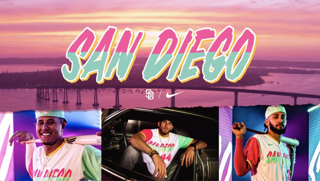
The Padres officially revealed their City Connect uniforms on Friday. The motto from the organization regarding these uniforms is “two countries, two vibrant cultures, together as one.”
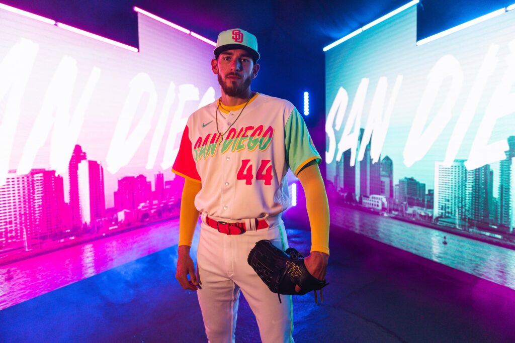
“The colorful highlights are a nod to the coastal community we call home. They’re inspired by the vibrant landscapes in the San Diego and Baja California communities. From the scenic views of the ocean’s white foam to the stunning pink and yellow sunsets.”
The team will wear these for every Friday home game for the rest of the season, starting next Friday, July 8, against the Giants.
The responses around the city and the country were generally positive.
The video the Padres dropped to officially announce their Nike City Connect uniforms is incredible 🔥https://t.co/I2II4AOsKh
— Talkin’ Baseball (@TalkinBaseball_) July 1, 2022
This is how you do it! https://t.co/NzEBJwinSS
— Chris Rose (@ChrisRose) July 1, 2022
https://twitter.com/JBWolfsthal/status/1542928215483850755?s=20&t=_bMMoOHDgGrS-oi0wdqreg
https://twitter.com/jlafferty21/status/1542908682693857282?s=20&t=_bMMoOHDgGrS-oi0wdqreg
These are perfect. https://t.co/k9tQDvSAwT
— Kate Feldman (@kateefeldman) July 1, 2022
Padres fans commented on the post with a variety of opinions.
“Para la cultura! Love it!”
“Well, they aren’t boring, that’s for sure.”
“Y’all copying Miami Vice should’ve went with the 90’s theme.”
“My only complaint is that the hat logo is just a recolored standard Padres hat. If they came up with some newer logo, it would’ve been better. But besides that, these jerseys are absolutely beautiful!”
“After watching the video, I freaking love the unis. Go, Padres!”
Of course, there are critics. Some think it’s too much like “Miami Vice” or even shades of retro Taco Bell. Other teams who have revealed their City Connect sets also received plenty of responses all over the spectrum. Nike expected this and maybe even hoped for it. They are supposed to draw attention. The colors are loud and flashy. They also do not look like anything the Padres have ever worn before. And, well, that’s OK.
The homages to San Diego’s heritage and south-of-the-border flavor all hit the mark. From the beaches to street tacos, to skateboarders along the coast, to the Mexican heritage throughout the city and throughout Baja California, these uniforms highlight the best San Diego and the surrounding region have to offer. Yellow for the bright sunshine San Diegans enjoy year-round. Pink for when the sun gets low and the sky is lit up with a myriad of vibrant colors. Green for the evergreen palm trees surrounding the area or the lifeguard posts that litter your favorite beach. The color combination also calls to mind shades of the Mexican flag.
[wpedon id=”49075″ align=”right”]
If you’re hungry, they also remind some of street tacos, with yellow tortillas, cilantro, white crema, and onion with your choice of meat.
These uniforms are not meant to replace the gold, and brown most fans love so much. It’s just another spice to throw into the delicious dish of Padres threads that now are seen in San Diego and wherever else you can find a Padres fan. The team store is already flooding with fans grasping at any piece of this new gear that they can find. Despite some criticism, overall, these uniforms are a victory for the team and the city.
The aim was to pay homage to the colorful, diverse, and charming cultures that make up the San Diego community. These uniforms are a wonderful tribute to the city and its people.
Native of Escondido, CA. Lived in San Diego area for 20 years. Padres fan since childhood (mid-90s). I have been writing since 2014. I currently live near Seattle, WA and am married to a Seattle sports girl. I wore #19 on my high school baseball team for Tony Gwynn. I am a stats and sports history nerd. I attended BYU on the Idaho campus. I also love Star Wars.
Miami, yes; San Diego, no.
So ugly, embarrassingly ugly
Yeah sorry, they look like ice cream men. The uniforms are a fail.
Pads fans fought for years to get our brown uni’s back. These ugly shirts are a slap in the face. Not to mention just clownish.
Spin it all you want- these are hideous and in no way “connect” to San Diego
They look like spumoni ice cream. Really stupid. Horrible.
The padres city connet uniforms are ugly! Compared to other city connect Uniforms, they look like the circus came to town.