The Best and Worst Uniform Sets in Padres History
Credit: Padres.com
THE BEST
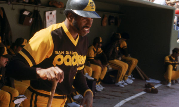
1978 Brown and Gold
The Padres only wore this version for one year, which is a travesty.
The gold on brown jerseys was the best combo, however, they also had a yellow top version. This still had a lot of the gold like the 1972 uniform but used as a compliment, not the feature color. This is when the brown really became the identity of the San Diego Padres.
I love the subtle “SAN DIEGO” above the Padres in these jerseys, only used for one year. The home uniforms were especially good, with the white with brown sleeves and yellow trim. 1978 was San Diego’s first winning season in franchise history, finishing 84-78. Dave Winfield was the star of that team, with 24 home runs and a 151 OPS+. The hats with the gold front were a very nice touch, which I am glad they brought back as part of the current Friday brown uniform.
1980-1984 Brown and Orange
This was the golden age of the brown Padres. Of course, it helps that they reached the playoffs and the World Series for the first time in franchise history. The iconic moment pictured above was Steve Garvey in Game 4 as his home run forced a Game 5 against the Cubs and the Padres eventually won the NL pennant.
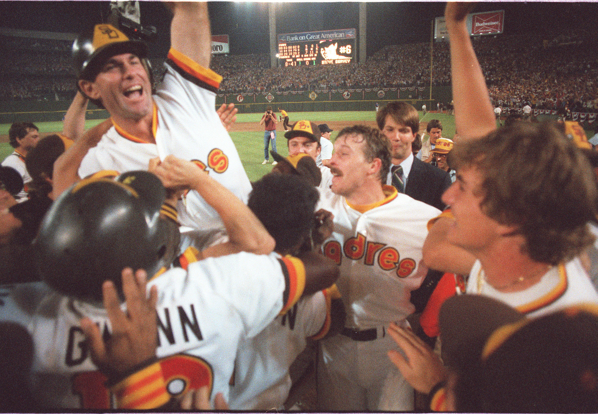
The brown on orange was an iconic look, very “80s.” The Padres were not the only team with that vibe, see Houston Astros. They kept the brown alternate tops that were from the 70s and gave it a new twist, with orange trimming. The “PADRES” was made bolder with an orange touch. When I look back and think of the Padres in brown, I usually go back to this time in franchise history.
This was also the first uniform Tony Gwynn wore as a Padre.
1991-2001 Navy and Orange with Pinstripes
The winner on the Twitter poll was the 1990s navy, orange, and pinstripes. Funny enough, the all-time favorite uniform for a majority of Padres fans is this set, which includes exactly zero threads of brown. How much of that has to do with the fact that they won two division titles and a National League pennant in these threads? Probably a lot.
Your favorite #Padres uniform set of this bunch? (Pictures in 2nd tweet for reference)
— Nick Lee (@NickLee51) February 8, 2019
For much of the duration of the poll, it was a three-way tie, with two brown uniform combos also being a favorite. Still, these are about as good as it gets for San Diego.
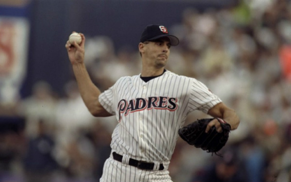
In a world where brown doesn’t exist, these would absolutely be the uniforms of choice. The pinstripes may be coming back, as hinted by that SDUT article as the Padres have worn several versions of the pinstripes. Most Padres fans picture the Padres in navy and orange when they think back on the last really good times in Padres history.
My personal favorite is the alternate navy top with orange numbers and white lettering. n addition, the road grays with the navy and orange bold lettering are the best road uniforms since the brown was removed.
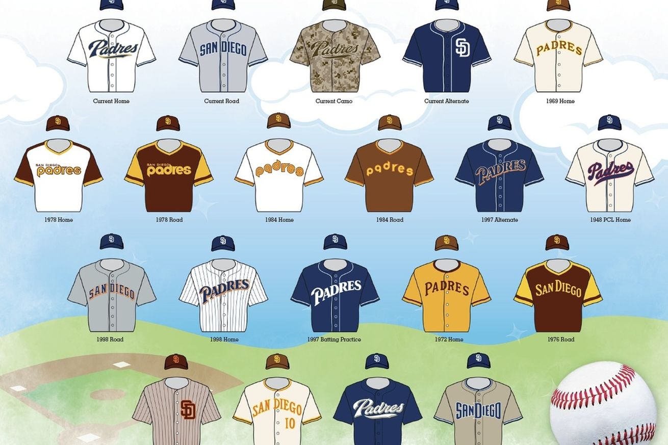
Like many Padres fans, I am hopeful that the uniforms they reveal next season will put an end to all of this madness. By my count, the Padres have worn 17 different uniform sets consisting of 32 different jerseys in 50 seasons. That’s a new uniform less than every three years. They have had some all-time greats and some swings and misses. No one can deny, whatever 2020 will bring will finally give the Padres a bit of their identity back that has been missing for many years.
Native of Escondido, CA. Lived in San Diego area for 20 years. Padres fan since childhood (mid-90s). I have been writing since 2014. I currently live near Seattle, WA and am married to a Seattle sports girl. I wore #19 on my high school baseball team for Tony Gwynn. I am a stats and sports history nerd. I attended BYU on the Idaho campus. I also love Star Wars.
Well the 2019 All White look horrible! It’s a new worst!
what we have now is the best
you’ve GOTTA BE KIDDING??? They’re horrible…
How we forget the worst “retro” when I believe they were in a St Lois summer with those thick wool PacCoastLeague uniforms. They looked like wet blankets by the 3rd inning. To make it worse I think the greatest sweater of all time Ashby was on the hill.
Fill in the details if you remember……
Best:
1985 Home, 1980 Road.
Worst:
Anything blue
I want boring uniforms and exciting players.
I like the idea of using the 84 home jersey as the Padres home jersey, and the 98 home jersey as the away.