Bring Back the Padres’ Pinstripes
(Photo by Stephen Dunn/Getty Images)
One of the things debated most by Padre fans is how the uniform should look.
Of course, part of the reason for this debate is that a significant portion of the fan base want to see the brown uniform permanently return.
Another reason for the debate is that ownership just can’t seem to decide on a pattern and stay with it. Since 2004, the uniform has gone through so many changes.
First, they completely changed the logo, making it into an image of home plate with palm trees and an ocean wave (which was a horrible idea). On top of that, the road uniform went from gray to tan, or sand. Or we can call it what it actually was — terrible.
The sand uniform went away in 2011, but no permanent solution has been made.
The uniform dilemma continues today. Last year, the team wore a blue-and-yellow color scheme, which they said was only temporary because it commemorated the team hosting the MLB All-Star game. They kept their word, and are not going to wear that color scheme this season (which is good because it will only remind people of the Chargers).
One uniform pattern can’t be agreed upon by everyone, but there is something the entire fan base can agree with — this team has no identity.
“Bring back the brown” is a movement that has picked up some momentum around the Padres community. Now, I want to introduce something different.
Bring back the pinstripes.
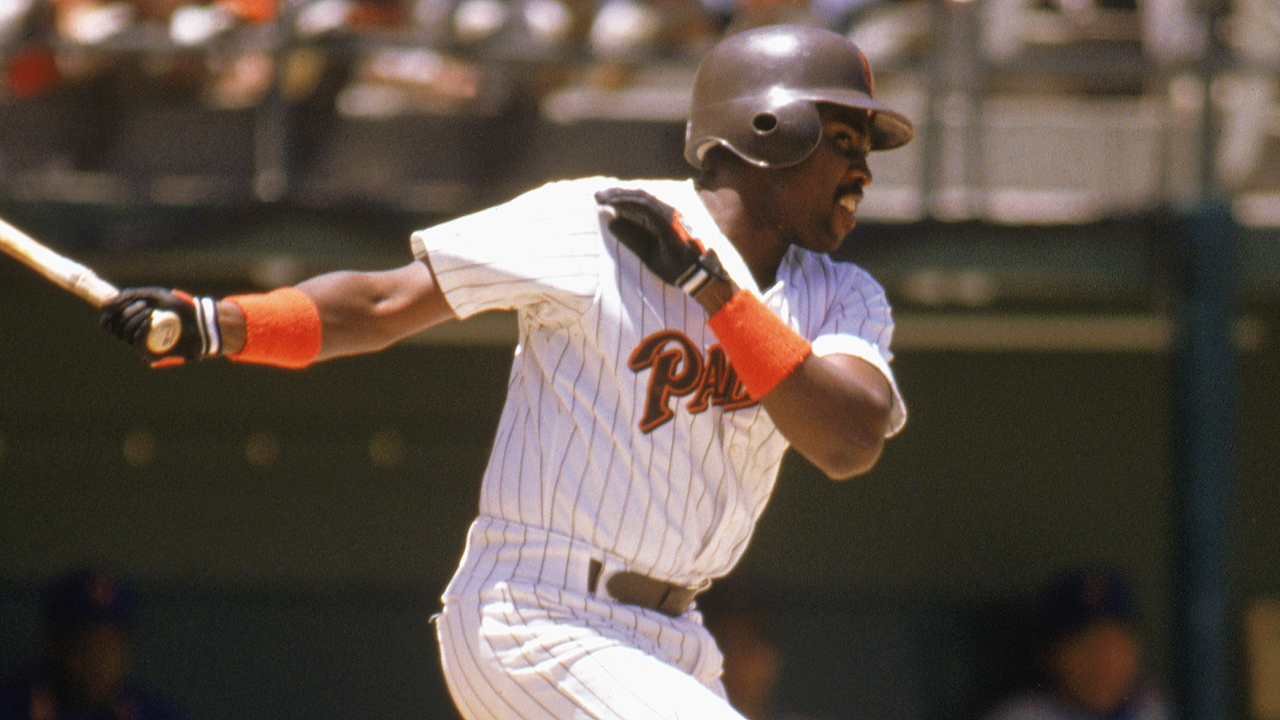
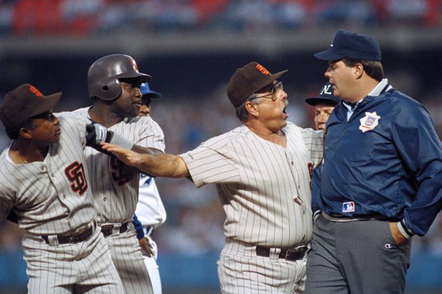
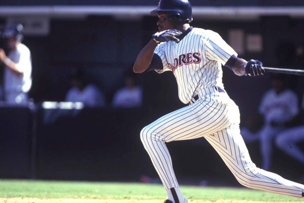
The pinstripes are associated with the Yankees. I get it. However, the Padres wore pinstripes during the 90’s, and the uniform then looked good.
Pinstripes have been a part of fashion for more than a century, from bankers, to sportsmen, to their longstanding presence in Major League Baseball. The Yankees wear them, yes. The Chicago Cubs have them. It’s what makes them identifiable.
Baseball teams need something in their uniform that makes them identifiable. It’s what turns a baseball franchise into a brand. Anyone can spot the Detroit Tigers just by seeing their old English “D” that the team proudly displays. You can spot a Dodger jersey because of the red numbers on the front. You can spot the Red Sox by the red “B.”
Can anyone spot a Padres jersey? No, they can’t. The jersey keeps changing. This team was once unique, but since then have tried to look like everyone else.
Give this team an identity they once had. During the late 80’s, the team wore a jersey with “Padres” across the front in brown with an orange trim, and brown pinstripes. It set them apart from the other teams. Yes, the Giants are brown and orange, but their pattern is different from what the Padres once wore. Also, the Giants don’t wear pinstripes.
Take away the blue and white pattern the team currently has, and replace it with the brown and orange pattern the team used to wear. Bring back the brown and orange, bring back the brown. Just don’t forget to bring back the pinstripes too.
Let’s not forget that the last time this team appeared in a World Series, they wore pinstripes.
I rest my case.
Mike is the sports editor for the Fayette Advertiser, and has been with East Village Times since 2015. His work has appeared on Bleacher Report. He is an avid Padres fan who is keeping the faith and trusting the process.
I thought the Giants are Black and Orange.
The ’90s Padre uniforms were the best they ever had. They wore those uniforms when they had their longest run of success and some of the Padres most iconic players wore that uniform. Never mind “bring back the brown”, bring back the orang and blue pinstripes! At least that is my opinion. 🙂
Totally agree…