The Best and Worst Uniform Sets in Padres History
Credit: Padres.com
Let’s review some of the best and worst uniforms in the history of the San Diego Padres.
It’s February. We are all watching every minute, hour and day go by ever so slowly as baseball season inches closer.
As I sit in my living room with a foot of snow pressed up against my glass doors, baseball season still seems very far away.
We still have no idea what the Padres will look like in 2019 with so many unsigned free agents still up for grabs. What we do know is what the Padres have looked like in the past, at least with their uniforms. As the Padres have announced that they are finally moving back to brown uniforms in 2020, let’s take one last look at the past.
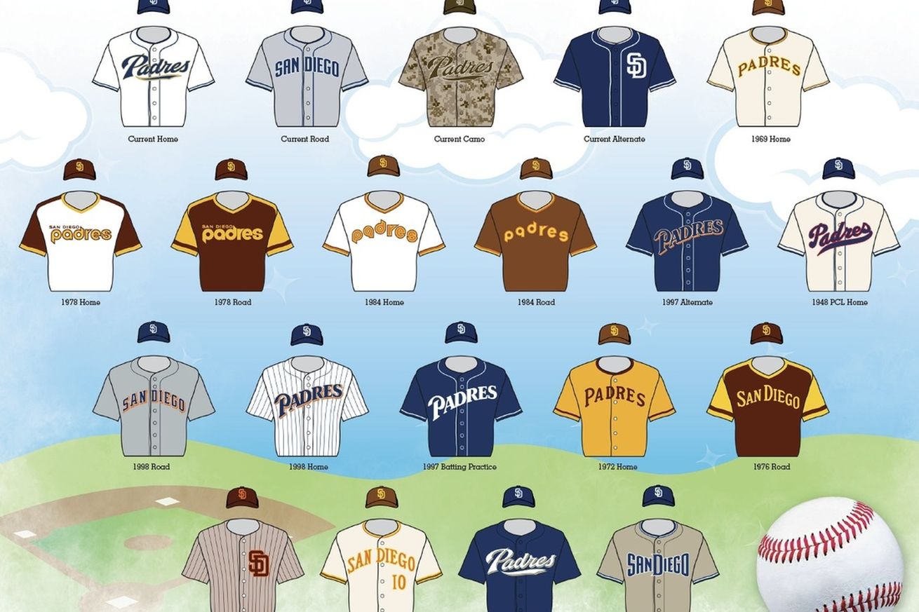
The Padres have had some pretty darn good looking uniforms, even without brown involved. They have also had some terribly ugly or boring uniforms, brown or otherwise. Let’s take a look back at the some of the worst and best uniform sets in franchise history. Unfortunately, some really good uniform combinations only lasted one year. I took those into account as well. I also took to Twitter and asked the people, pulling in over 300 votes.
The Worst
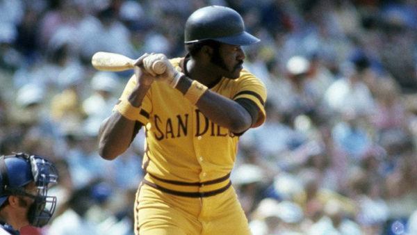
1972-1973 Mustards
For two years, the Padres wore nothing but mustard yellow from head to toe, with brown trim. This is an example of a time when the Padres did not look so good when they had brown in their scheme, as subtle as it was with these uniforms. Their home uniform was the same combo, just with “PADRES” on the front instead of “SAN DIEGO.”
Just in their fourth year of existence, the Padres were already in their second uniform set with these. These uniforms only last two years and the Friars went a combined 118-197 (.375) during these years.
Not all Padres uniforms looked great before they abandoned the brown and this is a prime example. Maybe with a home white version and less mustard-like pants, it could have looked better but alas, these make the list for making me think of the mustard I smother on my Randy Jones BBQ 1/2-pound slugger dog.
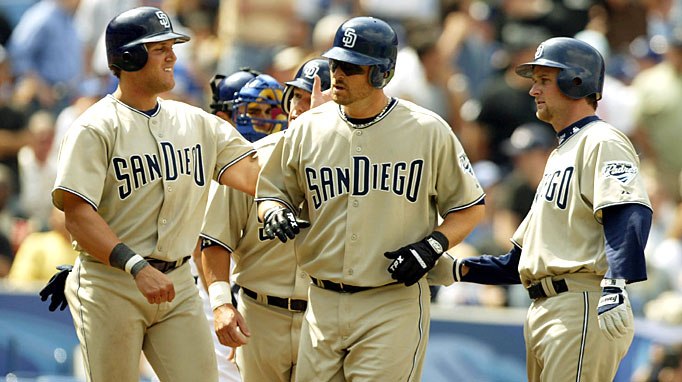
Mid-2000’s Sand
These were a strong candidate for “worst” but my Twitter poll awarded them second place. The Padres donned the sand road uniform from 2004 until 2010. They were unique and of course paid homage to one of the most prominent things we find in our fine city, sand. These uniforms were worn during some of the best times Padres fans have had this millennium. They won back to back NL West division championships in 2005 and 2006 and also had winning seasons in 2007 and 2010, their last winning season to date.
There is a small movement that wants sand to return in some form. I personally liked the navy alternate top that came with this set. My heart has softened a bit on the sands, perhaps because that was the last time the Padres were good. According to the San Diego Union-Tribune article that revealed the Padres were indeed bringing back the brown in 2020, there was a hint that the road uniform would be “solid tan and brown” with “tan and brown pants.” Perhaps they will model these after the road sand uniforms and make them less hideous.
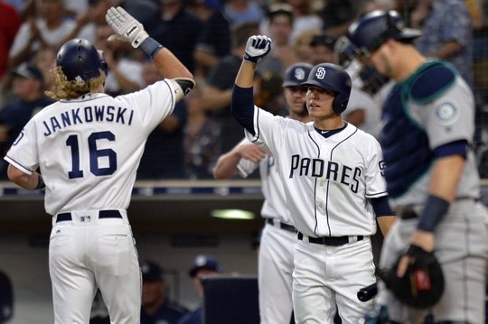
Current home/road combo
Speaking of boring, at least the previous two uniforms had something that the current Padres uniforms do not have: flavor and personality.
Perhaps even more fun for some of you, which of these is your LEAST favorite? (Pictures in following tweet) #Padres #EVT
— Nick Lee (@NickLee51) February 9, 2019
These are the most mind-numbingly boring uniforms in baseball today. The Twitter poll revealed that, among the four choices given, the current home and road sets are the least favorite among fans. I would take sand color over the “Create-a-Team Default Uniform1” combo that these are. It’s even worse with the all-navy hat and white “SD” logo. Not to mention the Padres have averaged less than 69 wins per season with these unis.
The only redeeming aspect of today’s uniforms is every Friday they don brown alternate tops which is a refreshing sight for sore eyes. They now have two options for camo uniforms on Sundays, frankly, I wish they would just pick one and stick with it. Thank goodness the Padres finally recognized the error of their ways and are going back to their roots next year. We only have to endure these horrendously dull uniforms for one more season.
PAGE 2 LINK BELOW
Native of Escondido, CA. Lived in San Diego area for 20 years. Padres fan since childhood (mid-90s). I have been writing since 2014. I currently live near Seattle, WA and am married to a Seattle sports girl. I wore #19 on my high school baseball team for Tony Gwynn. I am a stats and sports history nerd. I attended BYU on the Idaho campus. I also love Star Wars.
Well the 2019 All White look horrible! It’s a new worst!
what we have now is the best
you’ve GOTTA BE KIDDING??? They’re horrible…
How we forget the worst “retro” when I believe they were in a St Lois summer with those thick wool PacCoastLeague uniforms. They looked like wet blankets by the 3rd inning. To make it worse I think the greatest sweater of all time Ashby was on the hill.
Fill in the details if you remember……
Best:
1985 Home, 1980 Road.
Worst:
Anything blue
I want boring uniforms and exciting players.
I like the idea of using the 84 home jersey as the Padres home jersey, and the 98 home jersey as the away.