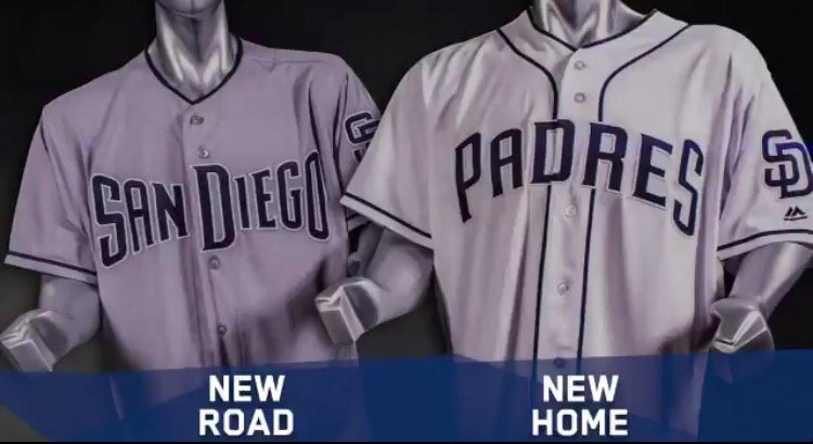
Padres Unveil New Uniforms for 2017 & Fans Cringe
Credit: Padres
Let me start this piece off by stating that my first priority with the San Diego Padres will always be the product on the field.
I am one who was never too concerned with bringing back the brown (although I would like that), and I also came to the Padres’ defense multiple times when they moved the retired numbers. Things like this are trivial, and ultimately, the product on the field means more than a uniform color.
However, this recent choice for another uniform change is just abysmal. First off, the fact the team is changing color schemes and design again really bothers me. Enough already with all the constant changes and alterations with font and such. Pick a color and stick with it.
Secondly, this is the best you could come up with? The uniform looks like dozens of other teams and provides no identity for a franchise starved for one. Obviously, these are not permanent uniforms and the fan base will have to endure this same situation next winter. Uniforms are not made to be changed every year. Especially if you are trying to build a sense of tradition with the team.
I have heard other fans describe all of our uniforms as costumes, and it is beginning to feel that way. To start the season in 2016, the Padres wore five different jerseys in their first six games. I wrote then that it was a horrible look for a team looking to build tradition, but yet the team continues to design new looks and pump out a new jersey every year.
I get it. It is all about the mighty dollar. Changing uniforms means more merchandise sales and increased revenue. Baseball is a business, there is no debating that. The dollar bill rules all and it is what makes the whole system go around. However, by alienating the fans and pissing them off, you are treading on dangerous waters. Be careful, Padres management team. Be careful.
Here is some of the reaction of the fans and what their feelings are on a new uniform.
Introducing the 2017 #Padres uniform lineup! pic.twitter.com/mDyUO7pMiX
— San Diego Padres (@Padres) November 22, 2016
Super stupid. I will not buy anything until they have the same uniform for five years. Like a normal team. https://t.co/H3AO91msAB
— Change the Padres (@ChangeThePadres) November 22, 2016
@Padres Super. Now we can continue to look like every other team with blue as its main color.
— Dave Brown (@padredave9) November 22, 2016
These are badass and what he Padres should be using all the time. pic.twitter.com/2zP7vJ72VF
— Dan Szymborski (@DSzymborski) November 22, 2016
I think the Padres entire uniform program exists to make pointless boring changes fans don’t want but make executives feel important. pic.twitter.com/ZybDQ14hA9
— Sac Bunt Chris (@SacBuntChris) November 22, 2016
The Padres have such a fun, colorful, unique uni history but choose to look like Penn State most games. I’ll never understand it.
— Tyler Kepner (@TylerKepner) November 22, 2016
Your move, #Brewerspic.twitter.com/MqENWqHz5f
— Jeff Sanders (@sdutSanders) November 22, 2016
Amazing that the Padres, as an organization, discussed uniform adjustments and came up with this incredibly bland product. All bad.
— Justin Havens (@jayhaykid) November 22, 2016
Oh good, Dodgers blue on the back, navy on the front. Consistency. Smart. https://t.co/pgjXUM4CRV
— Padres Jagoff (@PadresJagoff) November 22, 2016
wow, these suck a lot https://t.co/xPfpmHaZv7
— Productive Outs (@ProductiveOuts) November 22, 2016
I love my @Padres, but are you guys serious with these uniforms?
— Matt Winet (@MattWinet0) November 22, 2016
James was born and raised in America’s Finest City. He is a passionate baseball fan with even more passion towards his hometown Padres. Editor-In-Chief of EastVillageTimes.com. Always striving to bring you the highest quality in San Diego Sports News. Original content, with original ideas, that’s our motto. Enjoy.
Why don’t the Padres get with the benefits of technology and take a cue from the obvious outrage of their fanbase? There’s enough frustrated people on social media for them to know these aren’t going to cut it. Why won’t they consent to popular demand? These uniforms make me wonder if Mike Dee is still hiding in the closet around the office.
When will Ron Folwer get it, the San Diego Padres BELONG in Brown!
Why can’t they work with and update or take cue’s from the 1974 & 1975 uniforms?
Have the Two-Tone Brown and Gold hat for homes an ALL Brown with Gold SD logo for Road games and keep the current brown Friday alt jersey!
The 2017 uniforms are the WORST!
Hey Oscar, I can see everyones love for the brown, but I would personally prefer the late 80’s brown/orange pinstripes if they are going to go brown. It is cool/nice to see the brown on Fridays, but all season long might be a bit much in my opinion.
Wow, where did they come up with these? I for one, didn’t mind last years jerseys and compared to these, they were a God send. I do not know why they won’t go back to the 90’s blue/orange pinstrip unis full time? At the very least you can dream of Gwynn and Caminiti in their primes when you see those. On the bright side, by the time the Padres are good again, they will probably have had 2 or 3 different color schemes, and hopefully the one they pick to stay with for a while I like.
As for your comment about, “Changing uniforms, means more merchandise sales and increased revenue. Baseball is a business, there is no debating that”. I couldn’t agree more, but who is going to buy these jerseys? If they want to increase revenues, they have to put out a product people are going to want to buy. This move at least saved me some money this year.
PS Renfroe 71 it is!! I’m glad the girlfriend didn’t wait to get me one of these. 🙂 🙁